
Add-app-tation: Building a New Mobile App that Works
I’ve never been one to shy away from a challenge. I embrace the opportunity to push myself and learn something new along the way. One of the many benefits of working in UX is that you’re constantly learning: Learning about the business, about the users, or even learning new technology. For this project I was forced to learn fast and deliver results quickly.
I remember vividly where I was standing in the office when my manager approached me to have a quick conversation. I could see what it was by her expression. It was a request, and it seemed urgent. “We need to create a mobile app that lets our customers scan products, compile a list, and send the list to their sales reps.” “Oh okay” I replied, feeling somewhat relieved. “We need it in a week” she continued. Now that’s an ask I thought. “Alright, I will get on it.” Our conversation concluded and I got to work.
Working on products requires you to be comfortable operating with known limitations and uncertainties. In this case I knew I would be limited by time, by an inability to do more extensive research, and by my current knowledge and experience building an app. This would be the first app I would be developing on a mobile platform. I was a little anxious, but still confident that I could produce a functional product. The project was considered a prototype, so it didn’t need to be perfect, but it had to work well enough so we could gather feedback from customers.
Challenge
Rapidly develop a mobile app our customers can use to scan products.
My Role
Research, Information design, Interaction design, Coding
Project Time
1 week
Process
I started this project by compiling a list of TODOs. I realized I would be doing a lot of different things to get this done. And I’d likely need help. My list looked something like this:
- Define a list of requirements
- Research available technologies to build the app and pick the best ones for the job
- Information design, user flows, interactions, etc.
- Establish the look and feel, the app identity, and UI design
- Code the app, leveraging whatever libraries were needed
- Learn how to deploy the app
- Determine what resources I would need to help me get the above work done
Defining Requirements
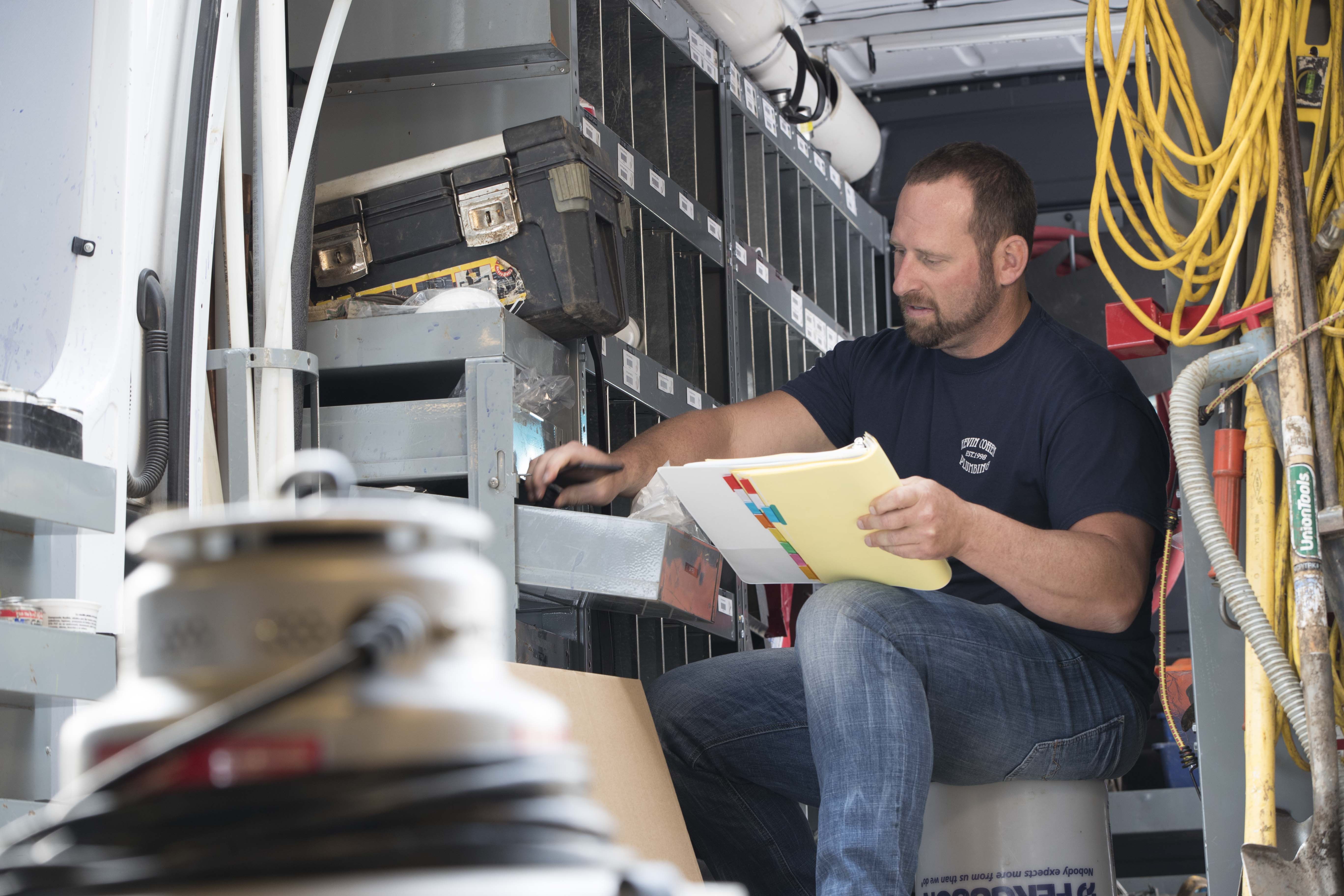
Creating a list of requirements is not an exciting step in any process but it’s an important one. Often overlooked, the consequence of not developing requirements is that you’re likely to miss critical functionality. You can fail to deliver what’s expected. To get the ball rolling I sat down with my manager who requested the work for a quick chat to learn more about this project. The requirements were:
- An app that could be used on both Apple and Android device
- Has a scanner feature that will scan our bar codes and translate it to product codes
- The ability to take the resultant codes and add them to a list of products
- A quantity variable can be added to each product list item
- Add, edit and delete functionality on list items
- An email feature where the user can send an email with the product list attached as a spreadsheet
- The ability to store as local data a “favorite” email address
The user story was essentially that we had customers who would frequently be restocking their trucks and warehouses and needed an effective way of building their replenishing lists to be emailed to our sales associates.
Once I had put together the requirement list and understood the user need, the next step would be to define a tech stack.
Researching available technologies
When I started to research the landscape of app development, things started to get real. The idea of having to create two separate apps, one for each platform, was simply not appealing to me considering the time-frame. If I could build the app once and deploy it to multiple platforms it would allow me to spend that time elsewhere. When all you have is a week to work, every hour counts.
At the time we were working on this project, mobile apps were en vogue but there were fewer choices available for front-end frameworks. React for instance was still very young, it was seen as a developing but unproven Facebook platform. Earlier that year I had gone to a dev conference and Angular on the other hand was presented as a mature platform that had a smooth learning curve. So while I looked at both, Angular seemed like the better choice to work with and if I got stuck there was plenty of documentation and resources available online that React lacked. I went with Angular.
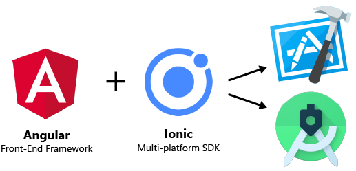
Next up would be to research cross-platform tools. It was at this point that I discovered Ionic. Ionic was promoted to be a product that could do the heavy lifting for multi-platform deployment and it accepted Angular. At once, a lot of my anxiety about this project would be quelled provided it worked.
The final hurdle would be in creating distributions for both platforms. For this I would need to become acquainted with Android Studio and Apple’s xCode. I made a note of it, saved the downloads as bookmarks and moved on to the next task at hand: design.
While I had spent time researching tools and technologies, I was coming to the realization that a lot of my time would be spent in the code. I needed to shift gears on my TODO list and get some help.
Enlistment
With consideration to the adventure that lay ahead I knew I’d benefit from offloading some of the work. I enlisted the help of a designer on our team to handle the UI design. He would be responsible for establishing the look and feel, implementing a UI kit, and usability testing the various versions of the app. We also had a developer come on board we could work with who would handle deployment. If I could get him a build of the app, he would ensure it would be available to our customers.
Time for design
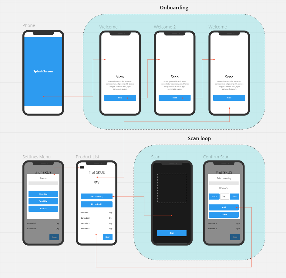
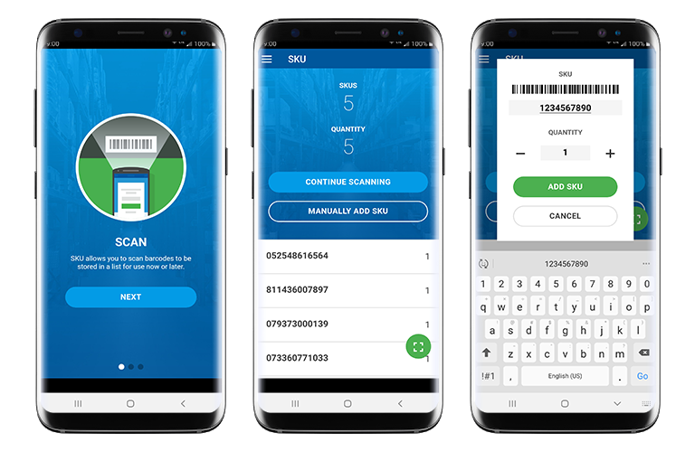
Once we parted out responsibilities I began thinking through the screens and user flow, and the content that’s needed while my teammate would focus on fleshing out the look and feel and UI design. My main concern was making sure the scan loop worked well. Scan product -> add item -> assign quantity. Rinse, repeat.
It was at this point we also realized the app would benefit from a series of welcome screens. I put a simple flow together accounting for key interactions and the diagram below begins to show the app taking shape.
I worked with my designer to think through the aesthetic. What would it look like? What would we call it? It’s a task-oriented tool. You scan products. I half-jokingly recommended ‘Skus Me’ but ultimately we landed on SKU. We pitched the idea to the Marketing department as well as the color-schemes we’d established and got the greenlight. As for the UI we ended up using Google’s Material.

Coding
When it came time to begin coding, my main concern was around the core functionality of scanning. Every device model is unique. How would the code account for this? Fortunately I was able to find a library that would solve my problem. Once I was able to successfully integrate this the rest of the development was fairly straightforward. Angular was self-explanatory and made creating usable UIs a breeze.
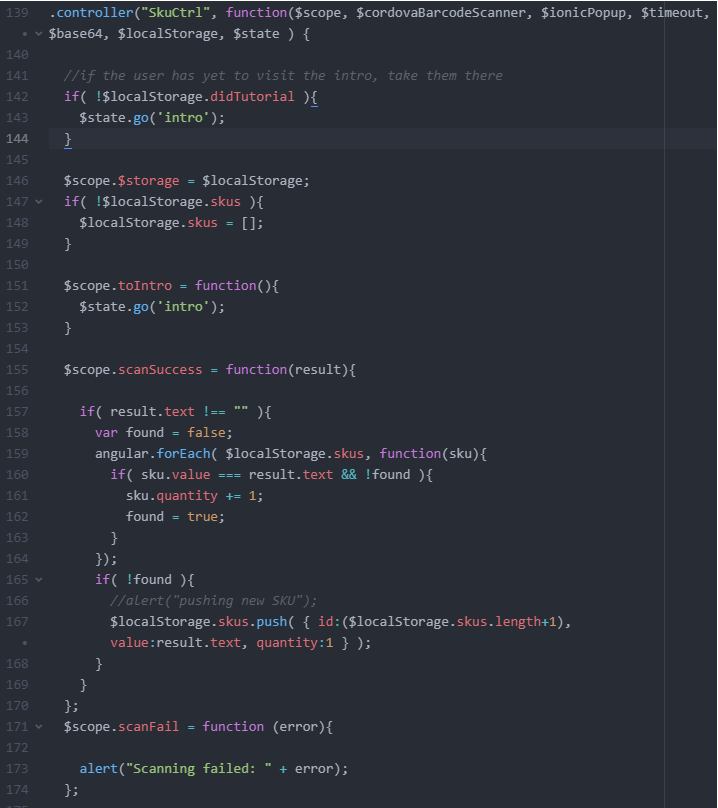
The Ionic integration was also seamless. Within 2 days we were close to a testable build. Far from perfect but it could functionally do what was asked.
The last step was to figure out the minutiae of deploying on Android and xCode, neither of which was very complicated (although they both have their own methods of doing things which is fun…)
Wrapping up
We still had an entire day of work left when we were putting the finishing touches on a prototype that could be put in front of customers for feedback. We sent the code over to IT where our developer handled deployment. We were elated we not only finished on time but we finished early. Ultimately the app made its way onto app stores and was an early predecessor to what is now core functionality in the Ferguson Mobile App. We passed off the app to IT and from there they continued to support it, adding functionality and making it better.
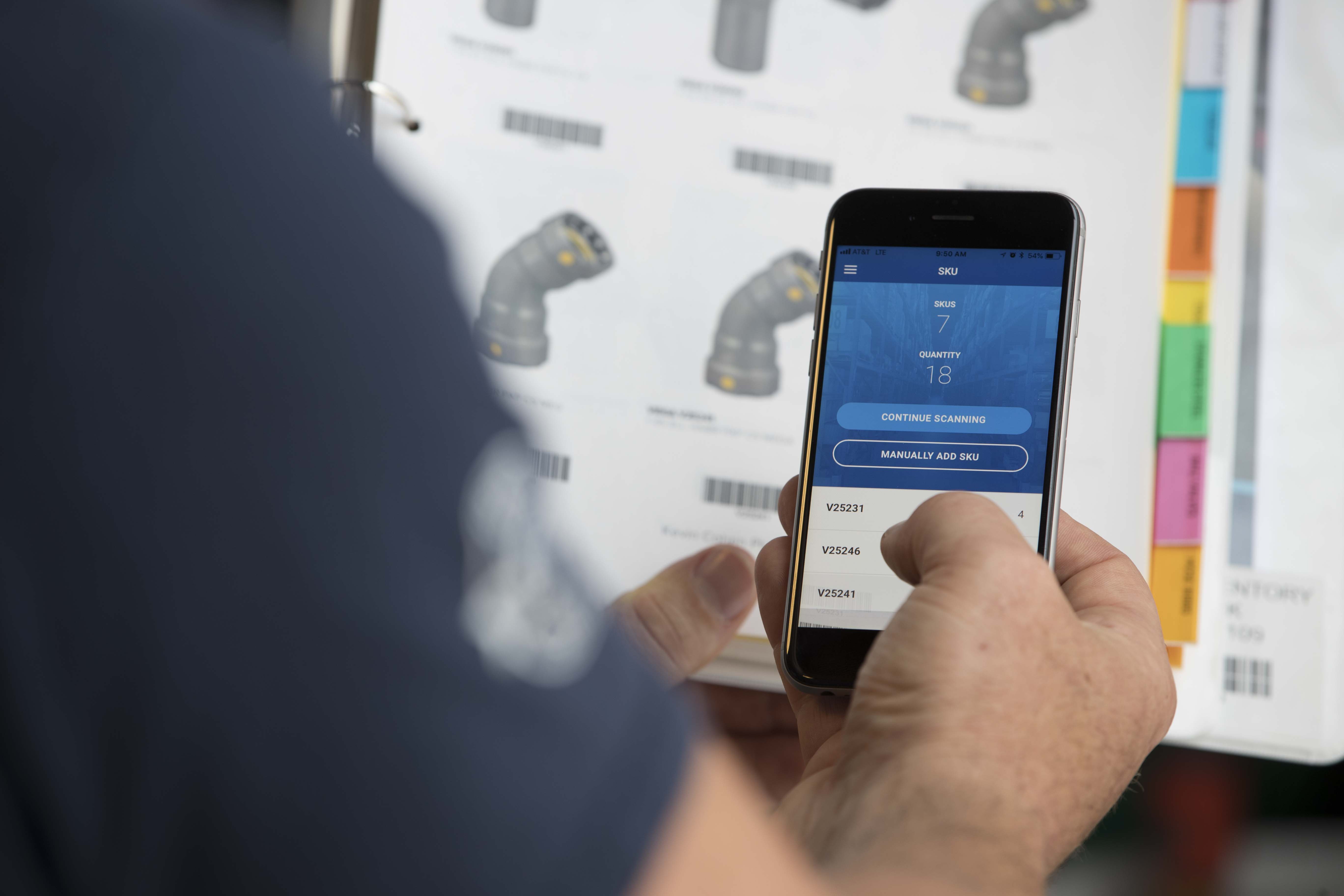
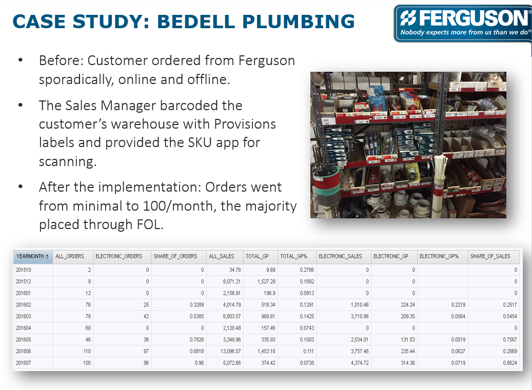
Many customers saw the app changing their behavior. For example, one company we worked with went from ordering very minimally to ordering over a hundred times every month shortly after the rollout. For customers like this, the app was a huge improvement to their work.
In the end I am able to look back on the experience I gained doing something I had never done before and deliver on time, all under a tight time crunch. We solved a business problem and ultimately filled a need for our customers.